Last Friday's session was our first proper teardown of Claude Design. Three of us — Arjit, Krishna, and myself — ran five different workflows through it to see where it's genuinely useful and where it falls apart. Every one of us hit credit limits. Here's what we learned.
For context: this was DesignX AI Session #8. We've been running these every couple of weeks — each one focused on a specific tool or workflow. We don't do surface-level demos. The point is to stress-test these tools against real work and report back honestly to the community. Claude Design had been out for a few weeks at this point, and enough of us had been poking at it individually that it made sense to compare notes.
Arjit Singh — Automating PowerPoint template fixes
The problem Arjit was trying to solve: His team at Info-Tech Research Group rebuilds a conference template every year. Researchers create their own decks for presentations, and they always drift off-template — wrong fonts, broken layouts, inconsistent styling. The design team ends up manually cleaning dozens of decks before every conference. It's tedious, repetitive, and exactly the kind of work you'd hope AI could handle.
What he tried: He screenshotted the existing PowerPoint template and fed it into Claude Design, asking it to extract a design system — cover layouts, color palette, type hierarchy — and then apply that system to clean up a messy researcher deck.
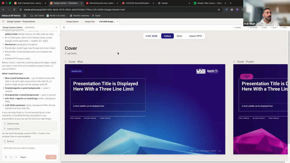
What worked: Claude Design actually pulled a usable design system out of the screenshots. It identified cover variants, layout patterns, and the color palette. The trick that made this work — and this is worth stealing — is that Arjit didn't just dump screenshots into Claude Design and hope for the best. He first went to Claude.ai (the chat product), described the template system, and had it write a detailed design-system prompt. Then he pasted that prompt into Claude Design along with the screenshots. That two-step approach — using one Claude to write the prompt for the other — consistently outperformed going direct.
What didn't: Since Claude Design doesn't support .pptx uploads, Arjit had to work from screenshots. That introduced problems immediately. Screen edges and window chrome got interpreted as design elements. Hexagonal shapes in the template got rounded into circles. A missing-fonts error kept firing and couldn't be dismissed. And the big one: when he exported the result back to .pptx, it came out stripped. Colors gone, backgrounds gone, charts gone. The round-trip destroyed the output.
Why this matters: A lot of design teams have exactly this problem — maintaining template consistency across non-designer contributors. The intake side (screenshots to design system) is surprisingly capable. But the output side (back to PowerPoint) isn't production-ready. If your final deliverable lives in the browser, Claude Design can help. If it needs to be a .pptx file someone else edits, you're stuck.
Bottom line: Web-native works. PowerPoint round-tripping doesn't.
Preet — Design system to "Agent Payments" dashboard
What I was testing: Whether Claude Design could take an existing design system and generate a functional product mockup from a brief. Not a landing page or a marketing site — an actual product interface with information architecture, data states, and interaction patterns.
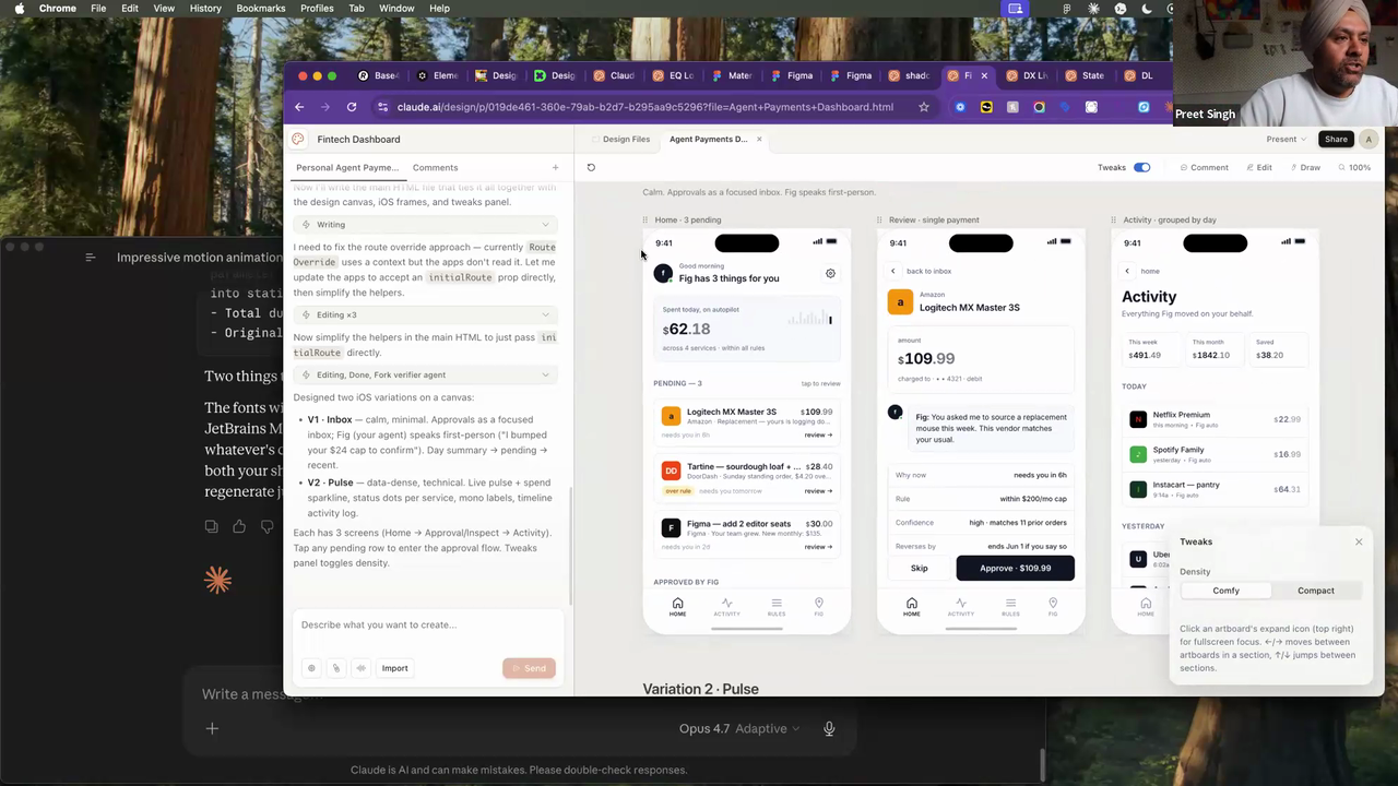
Setup: I imported a shadcn/ui .fig file as the design system and gave Claude Design a brief: mock an "Agent Payments" dashboard. The concept was riffing on Stripe's agent payments launch — a dashboard where businesses can monitor and manage payments made by AI agents on their behalf. I wanted to see if Claude Design could think through the product, not just render pixels.
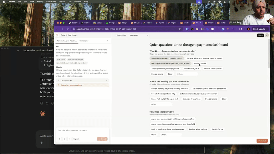
What worked: This is where Claude Design surprised me. Before generating anything, it asked a series of structured product questions: what types of payments are we tracking? What's the primary user's top job-to-be-done? Is there an approval flow? Each question had a "Decide for me" option, so you could skip what you didn't care about and let it make reasonable assumptions. That interaction pattern felt closer to working with an experienced product designer than any AI tool I've used — it was scoping the problem before jumping to solutions.
The output was strong too. It came back with two named design directions — "Inbox" (transaction-list-first) and "Pulse" (metrics-dashboard-first) — and a Comfy/Compact density toggle. Real product thinking, not just layout variations.
What didn't: The Comfy vs Compact toggle only changed padding and font sizes. A real density switch would rethink what information is visible at each level — collapsing secondary data, changing which columns show, maybe shifting from a table to a card view. This was surface-level density, not IA density. Also, the default color palette is this warm sand/beige theme that Claude Design seems to reach for unless you actively push it somewhere else. Apurv called it "the new purple" — referring to how every AI tool a year ago defaulted to purple gradients. He's not wrong.
Why this matters: Most AI design tools are good at visual generation but weak at product thinking. Claude Design's questioning flow is a real differentiator — it forces you to think through the product before you see pixels, which means the output is grounded in actual decisions. If you're an early-stage founder or a PM who needs to communicate a product concept to your team, this workflow is legitimately useful right now.
Bottom line: Solid for the product part of product design. The structured questioning is the real differentiator.
Preet — Restyling an existing site with a design.md
What I was testing: Whether you can take an existing live site and re-skin it by feeding Claude Design a design.md file — basically a structured spec of another brand's visual language.
Setup: I gave Claude Design a screenshot of our designleadership.io page (the DLS 2026 landing page) and paired it with a design.md file from Base44. The design.md was pulled from styles.refero.design — a relatively new tool that crawls popular SaaS sites and reverse-engineers their visual language into a structured design.md format (typography, spacing, color, component patterns). Think of it as a machine-readable brand guide that AI tools can consume.
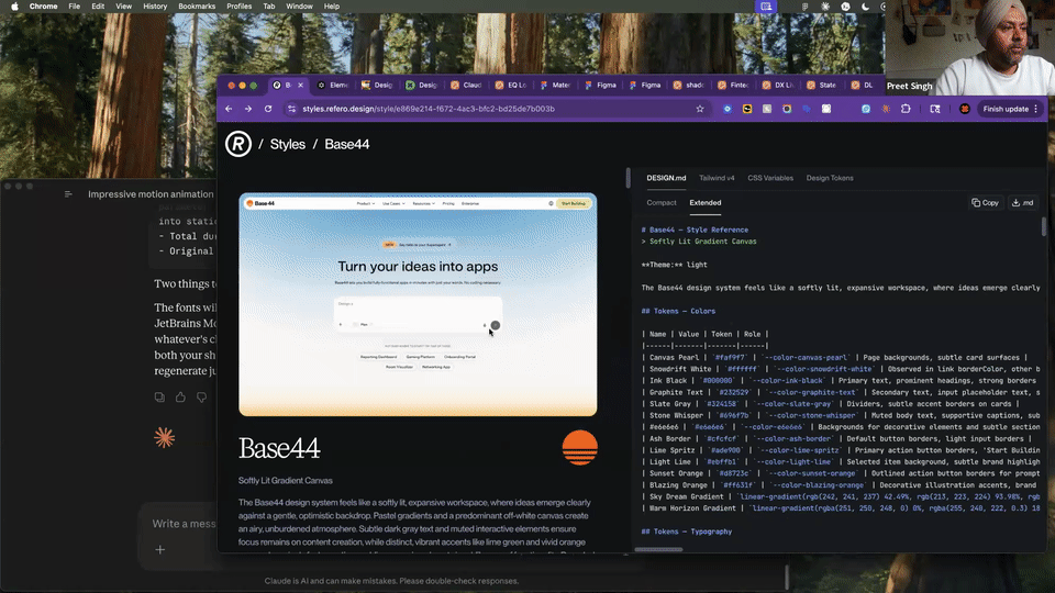
What worked: The typography and palette came through cleanly. The original DLS page has a fairly brutalist feel — bold sans-serif, high contrast, minimal decoration. With the Base44 design.md applied, it shifted to an editorial tone — serif headlines, warm card backgrounds, more breathing room. That's a meaningful brand direction change from a single prompt. No Figma file, no component library, just a design.md and a screenshot.
What didn't: Subtle gradients from the design.md spec didn't translate. And Claude re-wrote the headline copy between iterations without flagging it — "senior craft" became "senior leadership." That's a real risk in any AI design workflow. The tool is optimizing for what it thinks looks better, but copy changes in a headline can shift your entire positioning. You need to watch for it.
Why this matters: If you're exploring a brand pivot or pitching direction options to a client, this is a fast way to see what a different visual language feels like on your actual site. The design.md format is becoming a real thing — styles.refero.design and getdesign.md are both worth bookmarking. They're useful regardless of which AI tool you're using, because they give you a structured input format that any LLM-based design tool can work with.
Bottom line: Quick way to A/B a brand direction. The design.md ecosystem is the real story here.
Preet — Loaders and motion teasers
What I was testing: Whether Claude Design could generate usable motion assets — not full animations, but the kind of micro-interactions and teaser clips you'd use in social, presentations, or internal comms.
Setup: Two experiments. First, I gave it a single product photo of an EQ Bank card and asked for a card-reveal loader animation. Second, I fed it our State of Design survey data and asked it to build an animated teaser using its built-in animation templates — the kind of clip you'd post to Slack or LinkedIn to drive survey participation.
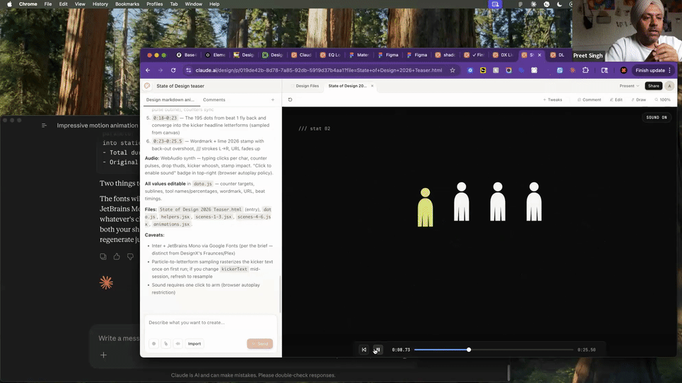
What worked: The survey teaser came out surprisingly usable. It picked up the data points, created text-stamp animations with figure icons, and the pacing felt right for a social teaser. The key advantage: animations come out as code (HTML/CSS/JS), not as After Effects or Lottie files. That means no designer-to-developer handoff — you can drop it straight into a site or tweak it in a code editor. For internal hype clips or social teasers, this is a real time-saver.
What didn't: The EQ Bank card loader fell flat. It got the general direction right — dark background, card floating in — but the execution was visually weak. The lighting felt off, the card edge rendering was rough, and it lacked the polish you'd need to actually ship it. You'd spend more time fixing it than building it from scratch in Figma or After Effects.
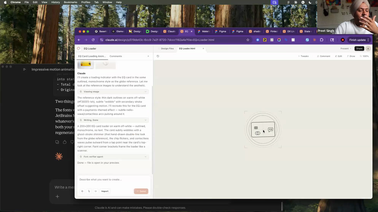
Why this matters: There's a gap in most design workflows between "I need a quick animated asset" and "I need to open After Effects and spend two hours." Claude Design sits in that gap for low-stakes motion — social teasers, internal presentations, placeholder animations. It's not replacing your motion designer, but it might replace the two hours you'd spend in Canva trying to animate a stat.
Bottom line: Good for low-stakes motion ideation. Not hero animations yet.
Krishna Yalamarti — Full handoff loop
What Krishna was testing: The entire pipeline — Claude Design for the visual design, Claude Code for the code export, and Figma (via MCP) for the design system handoff. He wanted to see if you could go from concept to production-ready assets in one continuous loop.
Setup: Krishna built a portfolio concept called "The Orange Pixel" — a three-act narrative site with the theme "squiggle to square" (raw creative energy refined into precise output). He used a prompt generator he'd built separately in Claude.ai to create detailed, structured prompts, then fed those into Claude Design to generate each section. Once the design was done, he exported to Claude Code and used the Figma MCP integration to push the components into Figma.
![]()
What worked: The portfolio itself is genuinely good. The color palette, gradient work, and animation feel are real — not the generic "AI-generated" look you'd expect. The three-act structure held together narratively. And the Claude Design to Claude Code handoff was clean — he got working HTML/CSS/JS that matched the design intent. Static elements (type, layout, color) also moved to Figma without issues.
What didn't: Motion got destroyed on the way to Figma. The MCP integration pushed static frames, but animated sections — which were the heart of the portfolio — either lost their animation entirely or showed up as broken partial layouts. Whole sections were missing from the Figma file. And the credit issue hit hard here: Krishna ran out of credits about 20 minutes into the session, which meant he couldn't test the full round-trip back (re-importing the index.html into Claude Design to iterate on the Figma feedback).
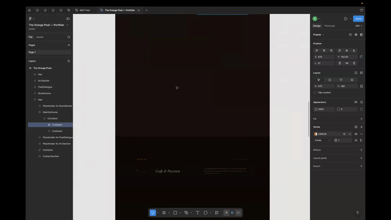
Why this matters: Krishna's demo is the most important one because it tested the thing every designer is wondering: can I actually use this in a real workflow end-to-end? The answer right now is "partially." The design-to-code path works. The code-to-Figma path works for static elements. But motion — which is increasingly central to modern product design — breaks in the handoff. And the credit ceiling means you can't iterate your way through it in a single session.
Bottom line: Claude Design to Claude Code is a solid pipeline. Claude Code to Figma loses the motion. The full loop isn't there yet, but the pieces are closer than I expected.
Three things across all five workflows
Strong at the product part of product design. Ideation, information architecture, design-system stress-tests, structured product thinking — this is where Claude Design genuinely adds value right now. Weakest at hero-level visual polish, motion fidelity, and round-tripping assets out of Claude's ecosystem into tools like PowerPoint or Figma.
The credit burn is real. This isn't a "play around and see what happens" tool at current pricing. Every one of us hit credit limits during the session, and Krishna couldn't finish his demo. If you're planning to use Claude Design for real work, budget for it. Know what you're trying to get out of it before you start, because exploratory noodling will eat your credits fast.
Source material matters more than prompting skill. The clearest pattern we saw: the quality of your input determines the quality of your output more than anything else. The hierarchy: design.md files > .fig component libraries > screenshots > prompt-only. If you're going in with just a text prompt, you're leaving most of the tool's capability on the table. Invest the time to prepare structured inputs.